Histogram With Points
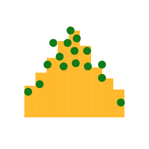
Displays density of distribution using bars along with actual values represented by points
Visual at a glance
- Category
- Distribution
- Certification
- Power BI Certified
- Best used for
- Displays density of distribution using bars along with actual values represented by points
About Histogram With Points
Traditional histogram charts illustrate the density of distributed data, but normally do not showcase specific values. Histogram with Points by MAQ Software addresses this issue by combining a histogram chart with points that show the actual data for each range. Easily track where data clusters (points) are across your data distribution (bars) to identify patterns, trends, and areas of opportunity.
Key benefits
- Configurable points and histogram bars
- Configurable X-axis, Y-axis-right, or Y-axis-left
- Configurable gridlines
- Able to show/hide all the elements listed above
Use cases
- Research: Find homogenized populations of customers
- Marketing: Identify vital demographic clusters for promotional campaigns
- Admin: Display employee salary distribution and salary variation for individual employees
What's new
- Enhance license notification handling and improve service plan checks in HistogramXY visual.
Feature walkthrough
Contact Us. Thank you for using Histogram With Points by MAQ Software. Have questions about this or any of our other Power BI custom visuals? For issues, contact Support@MAQSoftware.com. For priority requests or custom builds, contact CustomerSuccess@MAQSoftware.com.
FAQs
What is the Histogram with Points visual used for?
The Histogram with Points visual displays the distribution of numerical data using histogram bars along with individual data points. It is ideal for analyzing data patterns, identifying clusters, comparing distributions, and spotting potential outliers.
What data fields are required?
The visual requires a numerical data field to display the distribution of values. The data is grouped into ranges and represented using histogram bars and individual points.
Can I customize the appearance of the Histogram with Points?
Yes. You can customize various visual elements, including:
- Histogram bar appearance
- Data point appearance
- X-axis
- Y-axis
- Gridlines
- Axis display and formatting
Can I show or hide the histogram bars?
Yes. You can control the visibility of the histogram bars from the formatting pane based on your reporting requirements.
Can I show or hide the data points?
Yes. The data points can be enabled or disabled independently, allowing you to focus on either the overall distribution or individual values.
Can I customize the X-axis?
Yes. The X-axis can be configured to control its visibility and presentation, helping you display the numerical distribution clearly.
Can I customize the Y-axis?
Yes. The Y-axis can be configured according to your reporting requirements. The visual supports Y-axis settings for presenting the distribution values.
Can I show or hide gridlines?
Yes. Gridlines can be enabled or disabled from the formatting options. Hiding gridlines can provide a cleaner and more minimal visual appearance.
What business scenarios is this visual best suited for?
The Histogram with Points visual is commonly used for:
- Salary distribution analysis
- Revenue and sales analysis
- Customer value analysis
- Employee performance analysis
- Age distribution
- Product price analysis
- Test score analysis
- Transaction value analysis
- Identifying data clusters
- Identifying potential outliers
Can the visual help identify outliers?
Yes. Individual data points make it easier to identify values that are significantly different from the main concentration of the dataset.
Can the visual help identify data clusters?
Yes. The histogram bars show how values are distributed across different ranges, while the individual points provide additional visibility into where the data values are concentrated.
Does the visual respond to Power BI filters and slicers?
Yes. The visual updates when filters or slicers are applied, allowing the histogram distribution and data points to reflect the currently selected data.
Does the visual support interaction with other Power BI visuals?
Yes. The Histogram with Points visual can interact with other Power BI visuals through filtering and highlighting. Selecting data in another visual can update the data displayed in the histogram.
Can I select a histogram bar?
Yes. Histogram bars can be selected to interact with the corresponding data. Depending on the Power BI report configuration, the selection can affect other connected visuals.
Where can I report issues or request new features?
For support, bug reports, or feature requests related to the Histogram with Points visual, contact:
- customersuccess@maqsoftware.com
We regularly improve the visual with enhancements and bug fixes.