Visual at a glance
- Category
- Distribution
- Certification
- Power BI Certified
- Best used for
- Understand the mean, median, and quartile distribution of your data
About Box and Whisker Chart
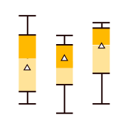
Compare large data sets in a compact space. Box and Whisker Chart by MAQ Software enables you to compare the distribution of values across several sets of data. In addition to showing the median, first and third quartiles, and the maximum and minimum values, this custom visual also displays the mean, standard deviation, and quartile deviation.
Key benefits
- Clear display of broad categories (i.e. financial quarter or geographic region) and the specific data sets within those categories (i.e. individual storefronts or products)
- Horizontal and vertical view based on reporting requirements
- Different shapes (circle, square, rectangle) for the mean icon and other data points
- Supports report tooltip
Use cases
- Sales: Compare quarter-over-quarter sales across geographic regions or market demographics
- Project managers: Analyze work output after major process changes
- Product developers: Compare different processes to develop the same product at an improved speed, accuracy, or overall functionality
Feature walkthrough
Contact Us. Thank you for using Box and Whisker Chart by MAQ Software. Have questions about this or any of our other Power BI custom visuals? For issues, contact Support@MAQSoftware.com. For priority requests or custom builds, contact CustomerSuccess@MAQSoftware.com.
FAQs
What is the Box and Whisker Chart visual used for?
The Box and Whisker Chart visual helps users analyze the distribution of data and understand key statistical measures such as minimum, maximum, median, quartiles, mean, standard deviation, and quartile deviation. It is useful for comparing multiple datasets in a compact and easy-to-understand format.
What data fields are required?
The visual requires:
- Value field containing the numeric data to be analyzed
- Axis field to group and compare data distributions across categories
Additional category fields can be used to create more detailed comparisons.
Which business scenarios is this visual best suited for?
The Box and Whisker Chart is commonly used for:
- Sales performance comparison across regions or periods
- Financial data distribution analysis
- Product quality assessment
- Process improvement analysis
- Manufacturing performance monitoring
- Academic performance evaluation
- Survey response analysis
- Project performance tracking
- Statistical comparison of datasets
What statistical measures does the visual display?
The visual displays:
- Minimum value
- Maximum value
- Median
- First quartile (Q1)
- Third quartile (Q3)
- Mean
- Standard deviation
- Quartile deviation
These measures help users understand data spread, variability, and central tendency.
Can I customize the appearance of the Box and Whisker Chart?
Yes. You can customize:
- Box colours
- Whisker styles
- Mean indicators
- Data point markers
- Axis formatting
- Labels
- Visual styling options
Does the visual support horizontal and vertical layouts?
Yes. The Box and Whisker Chart supports both horizontal and vertical orientations, allowing users to choose the layout that best fits their reporting requirements.
Can I customize the mean indicator and data point shapes?
Yes. The visual supports multiple shapes for mean indicators and data points, including:
- Circle
- Square
- Rectangle
- This provides flexibility in visual presentation.
Does the visual support Drill Down?
Yes. The visual supports drill-down functionality, enabling users to explore data at multiple levels when hierarchy fields are configured appropriately.
Does the visual support cross-filtering?
Yes. The visual supports Power BI cross-filtering.
Selections made within the Box and Whisker Chart can filter other visuals on the report page and respond to filters from other visuals.
Does the visual support report tooltips?
Yes. The Box and Whisker Chart supports Power BI Report Page Tooltips, allowing users to view additional contextual information when hovering over chart elements.
Can I hide individual data points or outliers?
Yes. The visual provides options to show or hide individual data points and outliers through the formatting pane, allowing users to focus on statistical summaries when required.
Can I compare multiple datasets in a single visual?
Yes. The visual is designed to compare the distribution of values across multiple categories or groups, making it easy to identify differences, trends, and variations.
What makes the Box and Whisker Chart different from a standard column chart?
Unlike a standard column chart that displays aggregated values, the Box and Whisker Chart provides statistical insights into data distribution, spread, variability, and outliers, helping users gain deeper analytical understanding.
Is the Box and Whisker Chart responsive?
Yes. The visual automatically adjusts to different report sizes and layouts to provide an optimal viewing experience while maintaining chart readability.
Is Box and Whisker Chart certified by Microsoft?
Yes. The Box and Whisker Chart is certified by Microsoft and complies with Microsoft's certification requirements for Power BI custom visuals, ensuring adherence to Microsoft's quality, security, and compliance standards.
Where can I report issues or request new features?
For support, bug reports, or feature requests, contact:
- customersuccess@maqsoftware.com
We regularly update the visual with enhancements, performance improvements, and new features based on customer feedback.