Visual at a glance
- Category
- Clustering
- Certification
- Power BI Certified
- Best used for
- Visualize data distribution across categories
About Violin Plot
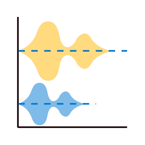
Violin Plot by MAQ Software enables you to easily view the distribution of data, including mean, standard deviation, quartile deviation, and probability density. With the plot's interactive slider and animated play/pause button, you can view and project trends across products, services, locations, and more.
Key Feature
- Interactive slider to view change over time or across categories
- Play/pause animation to view change over time or across categories
- Customizable data colors
- Cross-filtering with other visuals
Business uses
- Project managers: Compare team productivity across streams by using burndown data
- Sales and marketing: Project sales across products and analyze historical data for earlier campaigns
- Human resources: Predict, analyze, and plan team expenditure
Feature walkthrough
Contact Us. Thank you for using Violin Plot by MAQ Software. Have questions about this or any of our other Power BI custom visuals? For issues, contact Support@MAQSoftware.com. For priority requests or custom builds, contact CustomerSuccess@MAQSoftware.com.
FAQs
What is the Violin Plot visual used for?
The Violin Plot visual displays the distribution of data across different categories. It is ideal for comparing data distributions across products, services, locations, teams, and other categories.
What type of data can I use with Violin Plot?
The visual is designed to analyze numerical data across different categories. It can be used to understand how values are distributed within each category.
What statistical information does the Violin Plot display?
The Violin Plot helps visualize important statistical characteristics of the data, including:
- Mean
- Standard deviation
- Quartile deviation
- Probability density
Can I customize the appearance of the Violin Plot?
Yes. You can customize the data colors to match your report design and visualization requirements.
Does Violin Plot support viewing data over time?
Yes. The visual provides an interactive slider that allows you to view how the data distribution changes over time or across different categories.
Can I animate the data changes?
Yes. The Play/Pause animation feature allows you to automatically view changes in the data distribution over time or across categories.
Can I manually navigate through different time periods or categories?
Yes. The interactive slider allows you to manually move through the available periods or categories and observe changes in the distribution.
Can Violin Plot be used to compare different categories?
Yes. The visual is designed to compare data distributions across categories, making it useful for comparing products, services, locations, teams, and other groups.
Which business scenarios is this visual best suited for?
The Violin Plot visual is commonly used for:
- Sales analysis across products
- Marketing campaign analysis
- Team productivity comparison
- Employee expenditure analysis
- Historical data analysis
- Performance comparison across categories
Can Violin Plot be used for sales analysis?
Yes. Sales teams can use the visual to compare and project sales across different products and analyze historical sales data.
Can Violin Plot be used for marketing analysis?
Yes. Marketing teams can use the visual to analyze campaign performance and compare the distribution of results across different campaigns or categories.
Can Violin Plot be used to compare team productivity?
Yes. Operations and project teams can use the visual to compare productivity across different teams or work streams.
Does Violin Plot support cross-filtering with other Power BI visuals?
Yes. The visual supports cross-filtering with other visuals, allowing users to analyze related data interactively within a Power BI report.
Is the Violin Plot visual responsive to user interactions?
Yes. The interactive slider, Play/Pause animation, and cross-filtering capabilities allow users to dynamically explore changes in the displayed data.
Where can I report issues or request new features?
For issues related to the Violin Plot visual, contact:
- Support@MAQSoftware.com
For priority requests or custom builds, contact:
- CustomerSuccess@MAQSoftware.com