Visual at a glance
- Category
- Comparison
- Certification
- Power BI Certified
- Best used for
- Categorize hierarchical data with color-coded, proportional rectangles
About Treemap Bar Chart
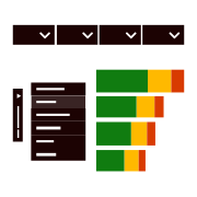
Tree Map Bar Chart by MAQ Software categorizes hierarchical data with sets of colored rectangles of proportionate sizes. The visual offers multiple views to ensure you gain the insights you need. Visualize performance with the gradient effect and size of bricks while making an efficient use of space by showing the distribution of values across categories.
Key Feature
- Customizable brick colors
- Customizable orientation between bar chart and column chart
- Total values and data labels for all categories
- Custom text and background colors
- Tooltips with additional insights
- Data legend
- Animation to examine the visual at the granular level
- Cross-filtering support for legend values, axis values, and bricks
- Bookmark support
- Report tooltips configuration support
- Drill through support
Business uses
- Sales: Analyze profit breakdown needs by country, region, and city
- Marketing: Highlight the performance of campaigns across location
- Social Media Marketing: Break down ROI on social media campaigns by platform
Feature walkthrough
Contact Us. Thank you for using Treemap Bar Chart by MAQ Software. Have questions about this or any of our other Power BI custom visuals? For issues, contact Support@MAQSoftware.com. For priority requests or custom builds, contact CustomerSuccess@MAQSoftware.com.
FAQs
What is the Treemap Bar Chart visual used for?
The Treemap Bar Chart visual helps users analyze hierarchical data using color-coded rectangles whose sizes are proportional to the underlying values. It enables users to understand the distribution of data across categories while efficiently utilizing report space.
What data fields are required?
The visual requires:
- Category or hierarchy fields
- A measure field to determine rectangle size
Additional category fields can be used to create deeper hierarchical structures.
Which business scenarios is this visual best suited for?
The Treemap Bar Chart is commonly used for:
- Sales performance analysis by country, region, and city
- Profit contribution analysis
- Marketing campaign performance tracking
- Social media ROI analysis
- Product category analysis
- Budget allocation visualization
- Revenue distribution analysis
- Market share analysis
Can I customize the appearance of the Treemap Bar Chart?
Yes. You can customize:
- Brick colors
- Background colors
- Text colors
- Data labels
- Visual styling options
These settings help align the visual with reporting and branding requirements.
Can I switch between bar chart and column chart layouts?
Yes. The visual supports customizable orientation and allows users to switch between bar chart and column chart views based on reporting requirements.
Does the visual support data labels?
Yes. The visual supports total values and data labels for all categories, helping users easily interpret the displayed information.
Can I use colors to highlight performance?
Yes. The visual supports customizable colors and gradient effects, helping users identify high-performing and low-performing categories at a glance.
Does the visual support cross-filtering?
Yes. The visual supports Power BI cross-filtering.
Users can interact with:
- Bricks
- Legend values
- Axis values
Selections automatically filter other visuals on the report page and respond to filters applied from other visuals.
Does the visual support report tooltips?
Yes. The Treemap Bar Chart supports Power BI Report Page Tooltips, allowing users to display additional contextual information when hovering over data points.
Does the visual support bookmarks?
Yes. The visual supports Power BI Bookmarks, allowing report authors to save and restore specific report states while maintaining visual interactions and configurations.
Does the visual support Drill Through?
Yes. The Treemap Bar Chart supports Power BI Drill Through, enabling users to navigate from summarized data to detailed report pages for further analysis.
What insights can I gain from the Treemap Bar Chart?
The visual helps users:
- Compare category performance
- Analyze hierarchical relationships
- Understand value distributions
- Identify top and bottom contributors
- Detect trends across groups and segments
Does the visual support animation?
Yes. The visual includes animation capabilities that help users examine data and transitions more effectively at a granular level.
Is the Treemap Bar Chart responsive?
Yes. The visual automatically adjusts to different report sizes and layouts to provide an optimal viewing experience while maintaining readability.
Is Treemap Bar Chart certified by Microsoft?
Yes. The Treemap Bar Chart is certified by Microsoft and complies with Microsoft's certification requirements for Power BI custom visuals, ensuring adherence to Microsoft's quality, security, and compliance standards.
Where can I report issues or request new features?
For support, bug reports, or feature requests, contact:
- customersuccess@maqsoftware.com
We regularly update the visual with enhancements, performance improvements, and new features based on customer feedback.