Visual at a glance
- Category
- Change Over Time
- Certification
- Power BI Certified
- Best used for
- Break down historical trading records into a simple, color-coded chart
About Trading Chart
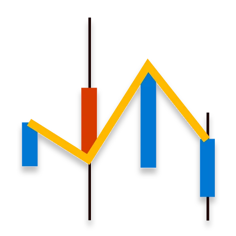
Trading Chart by MAQ Software translates historical trading records into an easy-to-read chart. Gray bars signify low and high price values. Red or green bars superimposed over the low and high values indicate the direction the stock moved.
Key Feature
- Color-coded bars (red bar indicates a stock's price has dropped; a green bar indicates the price rose)
- Customizable price ranges and time increments
Business uses
- Finance: Analyze the state of the stock market to make informed decisions
- Management: Highlight your organization's stock value over time
- Leadership: Analyze the state of competitor stock to inform valuable mergers and business opportunities
Feature walkthrough
Contact Us. Thank you for using Trading Chart by MAQ Software. Have questions about this or any of our other Power BI custom visuals? For issues, contact Support@MAQSoftware.com. For priority requests or custom builds, contact CustomerSuccess@MAQSoftware.com.
FAQs
What is the Trading Chart visual used for?
Trading Chart is used to visualize historical trading records in an easy-to-read format. It helps users analyze stock price movements and understand historical market activity.
Can I customize the price range in the Trading Chart?
Yes. Trading Chart allows users to customize the price range, making it easier to focus on the price levels that are relevant to their analysis.
Can I customize the time range in the Trading Chart?
Yes. The visual supports customizable time ranges, allowing users to analyze historical trading records over the period that is most relevant to them.
What do the gray bars represent?
The gray bars represent the low and high price values for a trading period. They provide a visual indication of the overall price range during that period.
What do the red and green bars represent?
The color-coded bars indicate the direction of stock price movement. A red bar indicates that the stock price has dropped, while a green bar indicates that the stock price has risen.
Can Trading Chart display historical stock data?
Yes. Trading Chart is designed to display historical trading records, making it useful for analyzing how stock prices have changed over time.
How can I identify whether the stock price increased or decreased?
The color-coded movement bars make the direction of price movement easy to identify. Green indicates an increase, while red indicates a decrease in the stock price.
Can Trading Chart be used to analyze stock price ranges?
Yes. The visual allows users to analyze the low and high prices for a trading period, making it easier to understand the overall price range and movement.
Can Trading Chart be used to analyze stock market trends?
Yes. Finance teams can use Trading Chart to analyze historical stock market activity and identify periods of increasing or decreasing prices.
Can Trading Chart be used to monitor an organization's stock value?
Yes. Management teams can use the visual to monitor an organization's stock value over time and review historical price movements.
Can Trading Chart be used to analyze competitor stock performance?
Yes. Leadership teams can use Trading Chart to analyze competitor stock performance and gain insights that may support strategic decisions and identify potential business opportunities.
Can Trading Chart be used to analyze different time periods?
Yes. By customizing the time range, users can examine historical trading records over different periods and focus on the timeframe relevant to their analysis.
Does Trading Chart support Power BI interactions?
Yes. Trading Chart supports interaction within Power BI, allowing users to explore the displayed trading data as part of an interactive report.
What business scenarios is Trading Chart best suited for?
Trading Chart is particularly useful for:
- Finance: Analyzing stock market activity.
- Management: Monitoring an organization's stock value over time.
Leadership: Analyzing competitor stock performance to identify potential business opportunities and support strategic decisions.
Is Trading Chart a Power BI Certified visual?
Yes. Trading Chart by MAQ Software is a Power BI Certified custom visual.