KPI Column
Measure your progress toward key performance indicators (KPIs) with an integrated line and column chart
Visual at a glance
- Category
- Comparison, KPI
- Certification
- Power BI Certified
- Best used for
- Measure your progress toward key performance indicators (KPIs) with an integrated line and column chart
About KPI Column
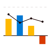
Clearly represent where your performance lies in relation to your targets. KPI Column by MAQ Software combines line and column charts. The columns represent performance, while the lines mark KPI targets. Each specific column changes color depending on how it compares to a target line value.
Key Feature
- An optional target value for all columns
- Current and forecasted data (forecasted data made translucent to differentiate it from actual values)
Business uses
- Sales: Measure upselling success ratio, quotation conversion, and other sales performance metrics
- Marketing: Measure bounce rate, click-through rate, and other marketing performance metrics
- Human resources: Measure staff advocacy scores, diversity index, and other operational metrics
- IT: Measure cost variance, schedule variance, and project tracking
Feature walkthrough
Contact Us. Thank you for using KPI Column by MAQ Software. Have questions about this or any of our other Power BI custom visuals? For issues, contact Support@MAQSoftware.com. For priority requests or custom builds, contact CustomerSuccess@MAQSoftware.com.
FAQs
What is the KPI Column visual used for?
The KPI Column visual combines line and column charts to measure performance against Key Performance Indicators (KPIs). The columns represent actual performance, while the line represents KPI targets, making it easy to compare actual values against target metrics.
What data fields are required?
The visual requires a Category field to define each data point and a Measure field to display the actual performance. You can also configure Individual Target values for each category, an optional overall Target value, and Forecasted data to compare projected and actual performance.
How does KPI Column compare actual performance against targets?
KPI Column compares actual performance against target values by combining columns with a target line. The columns display the actual measure values, while the line represents KPI targets. Each column changes color depending on how it compares to its target value, allowing users to quickly evaluate performance.
Can I configure target values and include forecasted data?
Yes. KPI Column supports both target values and forecasted data. You can configure individual target values for each category and add an optional overall target line across the chart. Forecasted data is identified using a Boolean forecast field and is displayed with transparent columns to distinguish it from actual values.
Can I customize the performance zones?
Yes. KPI Column allows you to customize performance zones by defining threshold values for Low, Medium, and High performance. You can also customize the colors associated with each zone, enabling the chart to visually indicate how actual values compare with their respective targets.
What Analytics does KPI Column support?
KPI Column supports optional analytics lines that help you gain additional insights into your data. You can display Maximum, Minimum, Average, and Median lines, and customize their colors and stroke width to match your report design.
Can I customize the appearance of KPI Column?
Yes. KPI Column provides several customization options, including bar colors, zone colors, chart orientation, fonts, data labels, background, and background watermark images. You can also adjust the opacity of background images and create custom report tooltips.
Does KPI Column support Report Tooltips?
Yes. KPI Column supports Report Tooltips, allowing you to display additional report pages with detailed information when users hover over a data point. This helps provide richer insights while keeping the main report uncluttered.
Does KPI Column support Bookmarks?
Yes. KPI Column supports Bookmarks, allowing you to create interactive reports that preserve the visual's state as part of a bookmark. This enables seamless navigation and storytelling within Power BI reports.
Can KPI Column display both positive and negative values?
Yes. KPI Column supports both positive and negative values. Forecasted values can also be displayed by using a Boolean forecast field, allowing you to compare actual and projected performance within the same visual
Which business scenarios is this visual best suited for?
KPI Column is commonly used for:
Sales: Measure upselling success ratio, quotation conversion, and other sales performance metrics.
Marketing: Measure bounce rate, click-through rate, and other marketing performance metrics.
Human Resources: Measure staff advocacy scores, diversity index, and other operational metrics.
IT: Measure cost variance, schedule variance, and project tracking.
Is KPI Column certified by Microsoft?
Yes. KPI Column is certified by Microsoft and complies with Microsoft's certification requirements for Power BI custom visuals, ensuring adherence to Microsoft's quality, security, and compliance standards.
Where can I report issues or request new features?
For support, bug reports, or feature requests, please contact customersuccess@maqsoftware.com . We regularly update the visual with enhancements and bug fixes.